
CTA for small business websites should not be treated like one generic button at the bottom of every page. A visitor who wants to book a massage appointment is not in the same mindset as a homeowner with a broken air conditioner, a contractor looking for project details, or a traveller checking campground availability.
For small businesses in Mississauga, Oakville, Milton, Burlington, and the wider GTA, the next step matters because local customers often arrive with a practical job already in mind. They may want to book, call, request a quote, check availability, get directions, or ask a question before buying.
A good website does not force all of those people into the same vague “Contact Us” path. It understands the customer’s intent and makes the right next step easy.
This article continues the website-foundation series by looking at call-to-action and contact flow through real local business scenarios, instead of abstract button advice.
Table of Contents
- [Why CTA for Small Business Websites Needs More Than “Contact Us”](#why-cta-for-small-business-websites-needs-more-than-contact-us)
- [The Real Question: What Does the Visitor Want to Do Next?](#the-real-question-what-does-the-visitor-want-to-do-next)
- [RMT and Massage Therapy: Make Booking Feel Immediate](#rmt-and-massage-therapy-make-booking-feel-immediate)
- [RAC, HVAC, and AC Repair: Help Urgent Customers Act Fast](#rac-hvac-and-ac-repair-help-urgent-customers-act-fast)
- [Accounting and Tax Services: Turn Uncertainty Into a Consultation](#accounting-and-tax-services-turn-uncertainty-into-a-consultation)
- [Renovation, Cleaning, and Handyman Services: Capture Project Details](#renovation-cleaning-and-handyman-services-capture-project-details)
- [Restaurants and Local Retail: Remove Basic Friction](#restaurants-and-local-retail-remove-basic-friction)
- [Vacation Rentals, RV Parks, and Campgrounds: Protect the Booking Moment](#vacation-rentals-rv-parks-and-campgrounds-protect-the-booking-moment)
- [How to Choose the Right CTA for Your Website](#how-to-choose-the-right-cta-for-your-website)
- [Make the Contact Flow Match the CTA](#make-the-contact-flow-match-the-cta)
- [Frequently Asked Questions](#frequently-asked-questions)
Why CTA for Small Business Websites Needs More Than “Contact Us”
Many small business websites use the same call to action everywhere:
- Contact Us
- Learn More
- Get Started
- Submit
These buttons are not always wrong, but they are often too vague.
When someone visits a local business website, they are usually trying to complete a specific task. They are not thinking, “I would like to interact with a generic contact form.” They are thinking something more direct:
- Can I book an appointment this week?
- Can someone fix this today?
- Can this business handle my tax situation?
- Can I get a quote for this project?
- Are they open now?
- Do they have availability for my travel dates?
The CTA should answer that moment.
A stronger CTA for small business websites connects the page to the visitor’s real decision. It tells them what to do next, what will happen after they act, and why the action is worth taking now.
The Real Question: What Does the Visitor Want to Do Next?
Before changing button colours or moving forms around, ask one practical question:
What is the visitor most likely trying to do on this page?
The answer will change by industry, service, and urgency.
A homepage may need broad paths such as “View Services,” “Book a Consultation,” or “Request a Quote.” A service page should usually be more specific. A booking-focused business may need a calendar. A repair business may need a phone number and emergency request option. A restaurant may need directions, menu, and reservation links.
This is why CTA strategy is really customer-flow strategy.
The button is only the visible part. The important part is whether the page helps the visitor move from interest to action without confusion.
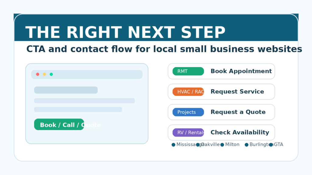
RMT and Massage Therapy: Make Booking Feel Immediate
Imagine someone in Oakville searching for an RMT after work. They may have neck pain, a busy schedule, and a short window to book before they forget.
They do not want to read five paragraphs of general wellness language before finding the appointment link. They want to know:
- Are there available appointments?
- Where is the clinic or studio?
- What are the rates?
- Is this a registered massage therapist?
- Can I submit insurance details or get a receipt?
- Can I book online without calling?
For an RMT or massage therapy business, a useful CTA might be:
- Book an Appointment
- Check Availability
- View Massage Services
- Book Your RMT Session
The contact flow should support that decision. The booking button should appear near the top of the page, after the service explanation, and again near pricing or location details.
If the business uses online scheduling, the website should connect visitors directly to available times. If booking requires a request first, the form should ask for useful information such as preferred day, preferred time, treatment type, and whether the visitor is a new or returning client.
The lesson: for appointment-based services, the website should reduce the distance between interest and booking.
RAC, HVAC, and AC Repair: Help Urgent Customers Act Fast
Now imagine a homeowner in Mississauga whose air conditioner stops working during a hot week.
That visitor is not browsing slowly. They may be comparing three local RAC or HVAC companies on a phone. They care about speed, service area, trust, and whether someone can respond soon.
A vague CTA like “Learn More” does not match the urgency.
Better CTA options include:
- Call for AC Repair
- Request HVAC Service
- Book a Service Call
- Emergency Repair Request
The page should make practical details easy to find:
- phone number
- service area
- emergency or same-day availability
- types of systems serviced
- business hours
- what information to prepare before calling
For urgent local services, the CTA should be visible without hunting. A sticky phone button on mobile can also help because many visitors are ready to call immediately.
But urgency does not mean the page should feel messy. The site still needs trust signals: licensing, years of experience, reviews, service guarantees, and clear expectations.
The lesson: for repair businesses, the website should help urgent customers contact you fast while still giving enough trust to choose you.
Accounting and Tax Services: Turn Uncertainty Into a Consultation
Accounting and tax services have a different customer journey.
A small business owner in Burlington may not be ready to buy a package immediately. They may first want to know whether the accountant can handle their situation:
- incorporated business or sole proprietor
- HST questions
- payroll
- bookkeeping cleanup
- tax filing deadlines
- cross-border or rental income questions
Here, “Contact Us” is not terrible, but it may not feel specific enough. The visitor may hesitate because they do not know what to ask.
Better CTA options include:
- Book a Tax Consultation
- Ask About Your Tax Situation
- Schedule a Discovery Call
- Get Help With Bookkeeping
The contact form should not be too long, but it should collect enough context to make the first reply useful. For example:
- individual or business tax
- business type
- service needed
- timeline or deadline
- short description of the situation
This helps the customer feel understood before the first conversation. It also helps the business avoid low-quality back-and-forth.
The lesson: for advisory services, the CTA should reduce uncertainty and invite a clear first conversation.
Renovation, Cleaning, and Handyman Services: Capture Project Details
A renovation, cleaning, or handyman visitor is usually trying to answer two questions:
Can this business do my type of job?
Can I get a reasonable next step without explaining everything twice?
For example, a homeowner in Milton looking for basement repair or a rental owner looking for turnover cleaning may need to share project details before anyone can quote accurately.
Useful CTA options include:
- Request a Quote
- Send Project Details
- Get an Estimate
- Tell Us About Your Project
The contact flow matters a lot here. A generic form with only name, email, and message may technically work, but it often creates friction for both sides.
A better quote form might ask:
- project type
- property location
- desired timeline
- photos or file upload
- approximate size or number of rooms
- whether the visitor owns or manages the property
This does not mean every visitor should face a huge form. The trick is to collect the information that makes the next step easier, not harder.
For project-based businesses, photos can be especially useful. If the website lets visitors upload images, the business can respond with better questions and a more realistic estimate.
The lesson: for quote-based work, the CTA should help the visitor explain the job clearly.
Restaurants and Local Retail: Remove Basic Friction
Restaurants and local retail businesses often lose customers because basic information is harder to find than it should be.
A visitor may not be ready for a long brand story. They may just want:
- menu
- hours
- address
- parking information
- reservation link
- phone number
- delivery or pickup options
- product availability
- directions from Google Maps
Good CTA options include:
- View Menu
- Reserve a Table
- Get Directions
- Call the Store
- Order Pickup
- Check Product Availability
For these businesses, the CTA should match the most common customer task. On mobile, hours, location, phone number, and directions should be extremely easy to access.
This is also where the website should connect smoothly with Google Business Profile. If the website says one thing and Google says another, customers may lose confidence.
The lesson: for retail and restaurants, conversion often starts with removing small practical annoyances.
Vacation Rentals, RV Parks, and Campgrounds: Protect the Booking Moment
Travel and accommodation websites have a high-intent visitor.
Someone checking an RV park near the GTA, a campground for a summer weekend, or a vacation rental for a family trip already has dates, budget, and expectations in mind.
If the website makes availability hard to check, the visitor may leave for Airbnb, Booking.com, Google Travel, or another campground directory.
Useful CTA options include:
- Check Availability
- Book Your Stay
- View Sites and Rates
- Reserve Your Dates
- Ask About Group Booking
The booking flow should answer practical questions quickly:
- available dates
- rates
- site or room type
- amenities
- pet policy
- cancellation policy
- check-in details
- distance to local attractions
Even if the final booking happens through a third-party system, the website should make the path feel intentional and safe. Visitors should understand where the button will take them and what information they need.
The lesson: for accommodation businesses, a weak booking path can push customers to platforms that take control of the relationship.
How to Choose the Right CTA for Your Website
A practical CTA for small business websites starts with the customer’s intent.
Use this simple framework:
- If customers need a time slot, use booking language.
- If customers have an urgent problem, use call or service-request language.
- If customers need advice, use consultation language.
- If customers need pricing, use quote-request language.
- If customers need basic local information, use directions, menu, hours, or call language.
- If customers are checking dates, use availability or reservation language.
The wording should be specific enough that the visitor knows what will happen next.
For iCloudMount, this is why website design is not just about visuals. A practical site should connect pages, forms, booking tools, and business processes in a way that supports real customer action.
That may include website design, booking system setup, e-commerce features, local SEO structure, CRM integration, or business automation depending on how the company receives leads.
Google’s SEO Starter Guide also reinforces a simple principle: helpful websites are built around users, not just search engines. A clear CTA and contact flow are part of that usefulness.
Make the Contact Flow Match the CTA
The CTA promise and the next screen should match.
If the button says “Book an Appointment,” the visitor should not land on a generic contact form with no calendar or appointment options.
If the button says “Request a Quote,” the form should ask for project details that help create a quote.
If the button says “Call for AC Repair,” the phone number should be tappable on mobile.
If the button says “Check Availability,” the visitor should reach availability information quickly.
This sounds obvious, but it is one of the most common gaps on small business websites. The page creates interest, then the contact flow creates doubt.
Before spending more on ads, SEO, or social content, review the actual path a visitor takes after clicking your main CTA. Try it on a phone. Ask whether the next step feels natural.
If it does not, improving the flow may produce more inquiries without increasing traffic.
Before driving more people to your website, make sure the site is ready to receive them. If you want help reviewing your CTA, booking path, or lead flow, contact iCloudMount or book a meeting.
Frequently Asked Questions
What is a good CTA for small business websites?
A good CTA for small business websites tells visitors the most useful next step based on their intent. For example, an RMT may use “Book an Appointment,” an HVAC company may use “Request Service,” and a contractor may use “Request a Quote.”
Is “Contact Us” a bad CTA?
“Contact Us” is not always bad, but it is often too vague. If the visitor wants to book, call, check availability, or request a quote, a more specific CTA usually feels clearer and more helpful.
How many CTAs should a small business website have?
Most small business websites should have one primary CTA per important page, with supporting secondary actions where useful. The goal is not to add many buttons. The goal is to make the right next step obvious.
Should CTA buttons be different by industry?
Yes. Different industries have different customer intent. Appointment-based services, repair businesses, restaurants, accounting firms, project-based contractors, and accommodation businesses often need different CTA wording and contact flows.
Can better CTA and contact flow improve local SEO?
Indirectly, yes. Clear pages, useful service information, strong internal links, and better user experience can support the overall quality of a local business website. The main benefit, however, is conversion: helping more visitors become inquiries, bookings, calls, or quote requests.